.:[Double Click To][Close]:.
Get paid To Promote 
at any Location


Showing posts with label design. Show all posts

Thursday, April 21, 2011

Designing with Purpose

Bill Buxton, a software design specialist at Microsoft, talks about product design and innovation.

He asks creative folks to think about focusing efforts on improving the human experience, and not just creating the next whiz-bang technology. He describe "renaissance teams" composed of computer scientists, social scientists and industrial designers.

Today's question: where have you found greater purpose in design recently?

Read more at Technology Review:
Designs with a Deeper Purpose - Technology Review

    Tuesday, April 19, 2011

    Where did my tax dollars go?


    And now the winners of Google's "Data Viz Challenge"! The Grand Prize went to Anil Kandangath for the visualization above. Here's a description of the competition from the site:

    "Every year, Americans fill out income tax forms and make a payment to the IRS. It’s an important civic duty, but it is also a lot of money. Where does it all go? Using data provided by WhatWePayFor.com, we challenged artists, coders, and the general public to create data visualizations that would make it easier for U.S. citizens to understand how the government spends our tax money."

    Try out Anil's winning entry and the rest of the competition here:

    Google Data Visualization Competition Winners


    Sunday, April 17, 2011

    Web Design Evolution

    Infographic from KISSMetrics exploring the history of web design over the last 20 years.

    Read more:

    Web Design Evolution: Two Decades of Innovation [INFOGRAPHIC]

    Monday, April 11, 2011

    Adobe's New Photoshop Touch Apps for iPad


    Today, Adobe announced upcoming apps and updates to Creative Suite all aligned with the iPad. Check out this video of Adobe Senior Vice President John Loiacono discussing the updates.

    Read more on AllThingsD:

    Adobe Recasts the iPad as High-Tech Palette for Photoshop

    Monday, April 4, 2011

    Why Apple Succeeds: Users, Not Designers, Have the Best Ideas


    Frog Design writes about creating ecosystems in which users and developers can grab the reins and be creative – and why that's a better strategy than trying to control the design yourself.

    Read more:

    Why Apple Succeeds: Users, Not Designers, Have the Best Ideas

    Wednesday, March 30, 2011

    This Is What Skype 5 For Mac Should Look Like

    Seems there are some very angry Mac users of the latest version of Skype. One person took matters into his own hands, and redesigned their interface for them.

    Read more:

    This Is What Skype 5 For Mac Should Look Like

    Friday, March 25, 2011

    A little bit of history repeating

    I like to use Things, a task management application, to wrangle all my day-to-day todos and projects. After trying several different applications, I chose Things largely because it seamlessly syncs to my iphone, ipad and mac laptop, and has just the right mix of powerful features that don't get in the way of just wanting to quickly manage todos.

    This post from Cultured Code's blog describes the team's approach to designing just one dialog: creating repeating events. This potentially complex interaction has been done very well, and very badly, in various calendar and todo applications. Here's an example of a team that got it right, and how they approached the design process.

    Habemus Dialogum – We Have a Dialog


     P.S. For those recognizing the lyrics referenced in the title of this post:

    Tuesday, March 15, 2011

    A Sneak Peek at Much Needed Blogger Redesign

    Blogger gave SXSW attendees a sneak peak at upcoming (and much needed) Blogger redesign work. As a Blogger user, I'm very much looking forward to giving this new interface a test drive.


    Read more at Blogger Buzz: What’s New With Blogger

    Monday, November 8, 2010

    The Lost Principles of Design


    Nice reminder about design fundamentals such as balance, contrast and proportion.

    Friday, August 13, 2010

    11 Principles of Interaction Design explained


    “Everything should be made as simple as possible, but no simpler.”

     - Albert Einstein

    Paul Seys, a UK-based user experience designer, describes 11 core principles of interaction design, including one of my favorites, Cognitive Load. Put simply, don't make users think.


    Thursday, August 12, 2010

    Your Design Is Wrong (And Here's Why)

    Mike Rundle explores the pros and cons of design critique on Dribble, and where design execution can go wrong. Mind that kerning!

    Your Design Is Wrong (And Here's Why) ~ Flyosity by Mike Rundle

    Thursday, July 22, 2010

    On Creativity and Design


    Matt Ward poses the question, can creativity and design be independent of each other? As designers, we can create beautiful, functional and highly usable experiences without necessarily being "creative", in the sense of bringing something into being that has never been seen before.

    However, as the web is a shared medium where, in most circumstances, the user is trying to *do* something, is this a bad thing? Is the thoughtful construction of typography and visual elements using a grid, open standards and best practices "creativity", or just clever synthesis? Interesting questions, as we think through our roles as both artists and practitioners.

    Read more:

    Wednesday, July 14, 2010

    Design Leadership

    This is a fantastic presentation from the creative folks at Frog Design, outlining what it takes to be a great design leader. Highly recommending reading for my creative brethren. Enjoy!


    Leah Buley at Adaptive Path references this presentation here:


    UX Design Leadership Model

    Tuesday, July 13, 2010

    Great iPad Apps for Web Designers


    Here's a great collection of iPad apps for designers, including sketching tools, analytics, web development, and one of my favorites, Air Display, which turns your iPad into a second monitor. Great for OmniGraffle palettes:


    Read more:

    10 Best iPad Apps for Web Designers | Tools

    Friday, July 9, 2010

    A Fresh Visual Identity for the Girl Scouts


    New visual identity for the Girl Scouts organization by Jennifer Kinon and Bobby Martin.

    Read more:

    A Fresh Identity for the Girl Scouts of America | Co.

    Friday, May 14, 2010

    modulR iPad case and iPad accessory system


    Interesting and elegant modular system of accessories for the iPad. Scheduled to be released this summer.

    Friday, April 30, 2010

    Designing for the iPhone and iPad - A Collection of Pre-Built GUI Kits


    If you are developing interfaces for the iPhone or iPad and are looking for pre-build GUI resources, check out this comprehensive collection from Speckyboy:

    Thursday, April 22, 2010

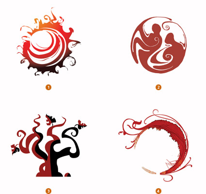
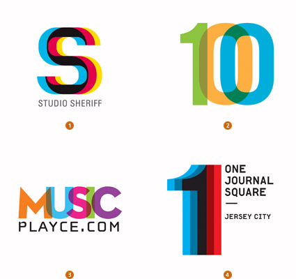
    2010 Logo Trends

    Beautiful collection of logos grouped by trend:


    Read more (hat tip to Jeff):

    Tuesday, April 13, 2010

    Designing for iPad: Reality Check


    Are you designing apps for Apple's iPad? Check out this blog post from Information Architects.jp.  They dig into typography, interaction design, the iPad's 3-dimensional elements and much more.

    They also include a ton of interesting insights into what worked for them, what didn't, and some of the ways they experimented to get their UX right. Definitely worth checking out: