.:[Double Click To][Close]:.
Get paid To Promote 
at any Location


Showing posts with label ux. Show all posts

Saturday, May 14, 2011

Using Data to Inform Design

Back in November I gave a presentation at DC Refresh titled Designing for One Billion People. One of the strategies I mentioned was being data-informed, rather than data-driven. The idea is that research and testing should be used to test hypotheses and inform decisions, but at the end of the day a designer has to base his or her decisions not just on numbers, but also other priorities like brand identity, business strategy and common sense.

[If you haven't already read it, Jeff Gothelf wrote a great post about this topic: "You vs. The Data: When to Stop Optimizing and Start Thinking."

This week, I have the privilege of joining Craig Green (web strategist at Network Solutions) and Paul Koch (marketing specialist at Viget Labs) on a DC Refresh panel moderated by Motley Fool's Greg Robleto to discuss data-driven design:

"This month’s event focuses on the science of making data-driven design decisions and the art of knowing when to listen and when to ignore the numbers. Join us this upcoming Thursday at Viget Labs for a panel discussion with seasoned experts in design, development and strategy as we discuss techniques, tips, and helpful tools for making calculated design decisions."

If you're interested in attending, we'll be at Viget Labs this Thursday evening at 6:30pm, May 19th. You can register (it's free) at Eventbrite:


Hope to see you there- be sure to say hello!


Monday, October 25, 2010

Understanding the Power of the Goldilocks Effect

Offering alternatives can help make the option you want end users to select more desirable. This strategy can also help end users feel more in control of the selection process, and ultimately feel better about their selection. Be careful, however, of offering too many options or too much complexity. Check out over 20 examples of this design strategy at work.

Persuasive purchase behaviour – Understanding the power of the Goldilocks Effect

Friday, August 13, 2010

11 Principles of Interaction Design explained


“Everything should be made as simple as possible, but no simpler.”

 - Albert Einstein

Paul Seys, a UK-based user experience designer, describes 11 core principles of interaction design, including one of my favorites, Cognitive Load. Put simply, don't make users think.


Wednesday, July 14, 2010

Design Leadership

This is a fantastic presentation from the creative folks at Frog Design, outlining what it takes to be a great design leader. Highly recommending reading for my creative brethren. Enjoy!


Leah Buley at Adaptive Path references this presentation here:


UX Design Leadership Model

Tuesday, July 13, 2010

UX Myth #3: People don’t scroll

People will indeed scroll to find what they want, and scrolling is more usable than breaking content up into multiple pages. Just be sure that content spans the fold, so readers know there's more below.

Read more, including a bunch of research links, one of which mentions a friend of mine Milissa Tarquini:

UX Myths - Myth #3: People don’t scroll

Friday, July 9, 2010

UX Myth #2: All pages should be accessible in 3 clicks

Ease of navigation and maintaining the "scent" of information – am I closer to what I'm looking for? – is much more important than requiring all pages to be within an arbitrary number of clicks.

More info and links to research:

UX Myths - Myth #2: All pages should be accessible in 3 clicks

Wednesday, July 7, 2010

UX Myth #1: People read on the web

As many of you already know, people scan rather than read the content on a page. In fact, one study estimates that people see less than 20% of the content on a page.

More info and links to research:

UX Myths - Myth #1: People read on the web

Thursday, May 13, 2010

Why Hasn't Location Reached the Mainstream Yet?

In spite of apps like Foursquare and Yelp, location based personalization hasn't really been embraced by the public at large. This Mashable article asks why, exploring privacy concerns as a key issue and positing that Facebook and Twitter may be the catalysts for a broader acceptable of these types of technologies.

Read more:

Thursday, April 22, 2010

New AddThis Gallery Examples


Today we released some new examples of fun menus created using AddThis APIs.  The menu above animates as the user rolls over the different sharing icons, and locks itself to the bottom of the page.

Check it out: Code | Demo

    Here's another example that places itself in the bottom right corner of the page, in a fixed position, and launches a stack of sharing icons:

    You can find out more about this implementation here: CodeDemo

      We also released a version of a sharing menu that maintains a fixed position in the top left corner of the screen.

      These examples and others in the AddThis Gallery were developed to help publishers understand just how completely customizable the AddThis sharing platform is – we hope you grab these, make them your own, or come up with other amazing ideas. We'd love to hear from you.

      Ed: Big hat tips to Jeff and Foo for all the hard work on these!

      Tuesday, April 13, 2010

      Designing for iPad: Reality Check


      Are you designing apps for Apple's iPad? Check out this blog post from Information Architects.jp.  They dig into typography, interaction design, the iPad's 3-dimensional elements and much more.

      They also include a ton of interesting insights into what worked for them, what didn't, and some of the ways they experimented to get their UX right. Definitely worth checking out:

      Wednesday, March 31, 2010

      Cry Me a River

      (Photo borrowed from Cornerstork)

      There's a coffee maker (oh, sorry, espresso maker...) in my office with which I'm having a tempestuous relationship. Every morning I make my usual quadruple espresso: two doubles gently mixed with a bit of low-fat milk and cinnamon. It's part of my routine, and makes me very happy, and awake.

      The problem is, this particular coffee maker (fine, espresso maker) always has something to complain about. Our strained exchanges of late go something like this:

      "Double espresso, please."

      Fill water tank.

      "Ok, double espresso please."

      Fill beans.

      "Fine. Make the espresso."

      Empty grounds.

      "Argh -"

      Rinse.

      "Why I oughta-"

      Warming up...


      Eventually, I get my lovely coffee beverage, and I usually only have to do one of these, sometimes two, but it gets irksome. Given, much of this is a constraint of a machine that is connected to neither a large bin of coffee bean, water source nor garbage receptacle. But still.

      Here's another example:

      Each time the power goes out in my house, I need to reset the time on the microwave I almost never use, but came with the house. Resetting the time on this particular microwave involves entering the time, am/pm and date.

      I never seem to remember to look to see what the date is before I try to reset the time, so I inevitably need to go find out in the middle of the process. In spite of this extra needed effort, the date appears to serve no useful purpose whatsoever.

      Recently, daylight savings time required setting the clocks ahead ("spring forward! fall back!") and you would think that, since I dutifully tell this microwave the date each and every time I lose power, this information would be used to automatically set the time ahead.

      Nope.

      When we design interfaces, its important to think about how the interface communicates with the user.

      Ideally, the interface should prevent the user from making mistakes in the first place, and not collect any more information that is necessary to complete the task.


      Users are task oriented. They just want to do what they want to do. They don't want to learn your interface, nor the clever intricacies of how information is collected or captured.

      Use existing conventions, handle issues inline and strive for an interface that is forgiving of its users' idiosyncrasies.

      And if you don't need the information, don't ask for it – less data entry will get you increased conversion and happier users. If my microwave isn't going to use the date to do anything useful, I really wish it didn't require it just to reset the time.

      If the user does make a mistake, and the mistake can be fixed or mitigated, the interface should do so. 

      I just looked up the spelling of "idiosyncrasies" because I was forgetting it was "idio.." not "ideo.." I tried using a browser tool called Ubiquity, but it couldn't find an entry because I wasn't spelling it right. Dictionary.com happily offered the correct spelling as long as I could get close enough.

      If the interface absolutely has to complain to the user, be user-friendly about it.

      Make the message clear, concise, friendly, and as much as possible try to make it the system's problem, not the users. Is there something – anything? – that the user can do next? If so, make it easy to do so, don't leave the user hanging with an error message and no idea how to fix things or continue.

      True, none of these things will probably help with my espresso maker, but hopefully will offer some small suggestions for your next project. And if it's possible to attach your next big idea to it's own conceptual water source and thus save your users a bit of time, effort and frustration, they'll thank you.

      Friday, March 12, 2010

      15 Desktop & Online Wireframing Tools | UX Booth

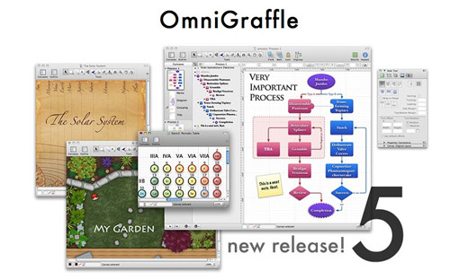
      Nice little writeup about desktop and online wireframing tools. At Clearspring, Jeff Wong and I use OmniGraffle pretty much end to end. I'll do concept diagrams and page flows with OG, and all of our page templates use the 960 grid to lock up wireframes and page mocks. We'll occasionally use Photoshop for more complex images, but the great thing about OmniGraffle is that we can use one application collaboratively from IA to UI to visual design, and move fast fast fast.

      In previous jobs at Netscape and AOL, we'd use the Adobe Suite – Illustrator for diagrams and wireframes, Photoshop for visual design. What tools does your team use?

      15 Wireframing Tools | UX Booth

      Thursday, March 11, 2010

      Big AddThis Design Release Today!

      After a ton of hard work from our design and web development team, today we launched updated analytics and a new look and feel for AddThis. Our design objectives included streamlining the global navigation and revisiting our 960 grid to refresh all of our page templates.

      We also significantly expanded our analytics offering for the 800,000 sites that use AddThis for sharing.

      Huge hats off to Jeff Wong (creative direction), Foo (CSS/HTML) and Philip Sharp (dev lead), as well as our whole QA team.

      Our awesome community manager Justin Thorp (Twitter/Blog) will be blogging more about the new features later today over on the (new!) AddThis Blog. For those interested in some of the process and specifics that went into this redesign, Jeff and I will be blogging about that topic over on the AddThis blog soon, stay tuned.

      Here are some before and after screen grabs. 

      Home page, before:


      After:


      Expanded analytics, before:


      After:


      At Clearspring, we get to play in the world of sharing everyday. We wanted to try to capture some of that fun with a new design for the AddThis blog.

      Before:


      After:


      And we're just getting started – stay tuned for more analytics and design enhancements coming soon. In the meantime, check out the new and improved AddThis.com. We'd love to hear what you think.

      Tuesday, February 23, 2010

      Sunday, February 21, 2010

      Oblong Gesture-Activated Interfaces


      Remember Tom Cruise culling through information in Minority Report (2002) using that gesture-activated interface? Interfaces like that aren't just science fiction anymore. Check out this article about Oblong Industries, founded by John Underkoffler, who led the original team that developed the MR interface.
      The second link is an Oblong video demo of their work on Vimeo:

      Flickr: The User Experience Sketches Pool


      Looking for some brainstorming inspiration? This is a great collection of sketches from all kinds of user experiences.  The one above is an old whiteboard brainstorm from years ago. Enjoy!

      Flickr: The User Experience Sketches Pool

      Thursday, February 18, 2010

      Taking the Pulse of Sharing: A Closer Look at the New AddThis Service Directory

      One the most interesting aspects of my job at AddThis is having the opportunity to use data to drive design decisions. The AddThis sharing platform is immense, and as a designer I'm incredibly fortunate to have access to a huge amount of information to help us optimize user experience for both publishers and their visitors.

      At the core of this experience are the hundreds of different services (currently 233) used to save and share pages, as well as lots of lots of other things like printing, translating, converting to PDFs, shopping, and more.

      Now with today's launch of the next AddThis Service Directory, you can explore all different kinds of trends across services and countries to understand how the world is sharing. One of the things we discovered early on is that when you step back and look at the bigger picture, across over 50 languages and hundreds of locales, sharing is much more varied and interesting than just Facebook and Twitter. For instance, in Brazil, Facebook is only #5 – Orkut is #1 with 25% of sharing. In China, Google Bookmarks is #1.

      I thought I'd take a look at one my personal favorites, Email App, a service you can use to share any link using your computer's native email application. It's currently our fastest trending service, up 56%:
      This sharp increase in usage began when we added an easy way to discover this and other email services to our email form:


      This change helped to boost usage of the other email services as well:


      Using these kinds of tools, we can understand whether a particular design decision works, and compare different approaches to offer our users the most effective experience we can.

      Wednesday, February 17, 2010

      Shock, Awe & Virality

      Admit it, you've done it. You could have kept it to yourself, but you just had to spread it around. Who could blame you? It's easy to do.

      I'm not referring to a virus, of course, but instead that news article about the King Tut's cause of death or Tiger Woods' latest mishap.

      The authors of this paper studied over 7000 New York Times articles to research which factors cause content to be viral. What makes us want to share something?

      They identified several factors including content that is:
      • Awe-inspiring
      • Surprising
      • Emotional
      • Useful
      • Positive
      Fascinating article, check it out:

      Social Transmission and Viral Culture « ResourceShelf

      Thursday, February 11, 2010

      Great products don't have to be good?

      "What are the three (or fewer) key features that will make your product so great that you can cut or half-ass everything else?"

      I've blogged a few times about focus and prioritization in experience design; this blogger uses the context of ongoing discussions about the upcoming iPad to posit that if your product is great, it doesn't have to be good.

      One of the reasons I'm excited about the iPad is that I've noticed how much more time I spend doing non-phone things on my iPhone: browsing, music, messaging, Facebook, RunKeeper (for swimming, no less!), Tweetie, etc. For those of us who use our smartphones more like portable computers than phones, the iPad offers a potentially better and more efficient experience... or so we hope. We shall see.

      In the meantime, give Paul's blog post a read. What are your three key features?
       
      Paul Buchheit: If your product is Great, it doesn't need to be Good.

      Thursday, December 31, 2009

      Creative Headers and Footers


      Gisele Muller blogs about designers who use evocative headers and footers to frame their user experiences. She notes that while headers have always been crucially important, creative treatments for footers are just coming into their own. Definitely a great source of inspiration.
      Headers and Footers that Grab You Coming and Going | Web Design Ledger

      Shared via AddThis